Case study
Redesigning Banking for
Millions of Bangladeshi
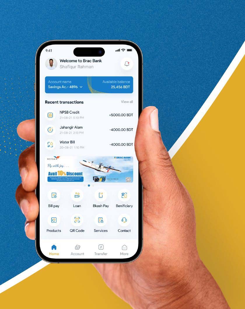
BRAC Bank app brings you effortless and the most secured banking experience at your fingertips.
Project Overview
Brac Bank is a leading commercial bank in Bangladesh, serving millions of customers through a network of branches and digital channels. The bank's mobile app, called "Brac Bank Mobile App," is a key part of its digital strategy, providing convenient and secure banking services to its customers on the go. In this case study, we will examine the design, features, and performance of the Brac Bank mobile app, as well as its impact on the bank's business and customer experience.
Why Redesign?
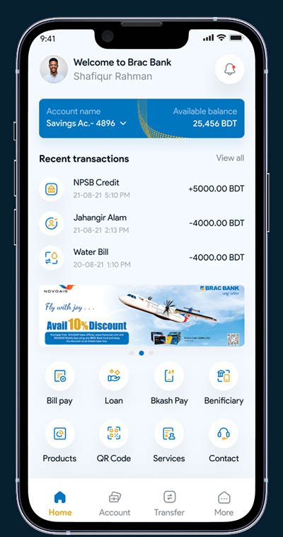
I redesign Brac Bank Mobile App to provide a better banking experience for its customers. The new app will have a refreshed user interface, making it easier and more intuitive to use. We have updated some features, such as managing all accounts in one place, easier transfer process, banking product recommendation to help customers manage their finances and make informed decisions. The project aims to improve customer satisfaction while also supporting the bank's digital transformation goals.
01 — Process
Design Process Followed
A user-centred process, from problem finding through to a tested, high-fidelity design.
Discovery
- Problem Finding
- User Research
- Design Strategy
- Competitor Analysis
Analysis
- Brain Storming
- User Flow
- Information Architecture
- Paper Sketch
Design
- Hi-Fi Wireframe
- Visual Design
- Prototype
- User Testing
02 — Timeline
Scope of Work & Timeline
Six weeks, three phases — research and analysis front-loaded so the design phase had real evidence behind it.
03 — Research
Desk Research
For Brac Bank app redesign I looked into existing data, their Play Store app & iStore review section, Brac Bank Facebook page posts & comments section, also individual Facebook posts & comments for problem finding.
I have had a great experience before the recent update. But my app keeps closing on launch after the update. I have tried uninstalling and reinstalling the app. But I am facing similar issues.
4 people found this review helpfulAfter updating, it's not opening/working at all !!! Install & uninstall several times for the last few days, but nothing !!! There was update information that's why updated ! Need Help.
1 people found this review helpfulWhy showing again and again "brac bank astha app has stopped?" I've already done app uninstall and installed, power on/off my mobile but same problem I've face????
2 people found this review helpfulPathetic UI, i think you need to focus on quality rather than quantity of services you can provide. Also 4 digit OTP is much better than 6 digit.
2 people found this review helpfulWhy Authorization Mode only SMS? I use the BRAC app from UK. And used email for Authorization. Now I can't after the new update.
2 people found this review helpful04 — Interviews
User Interview
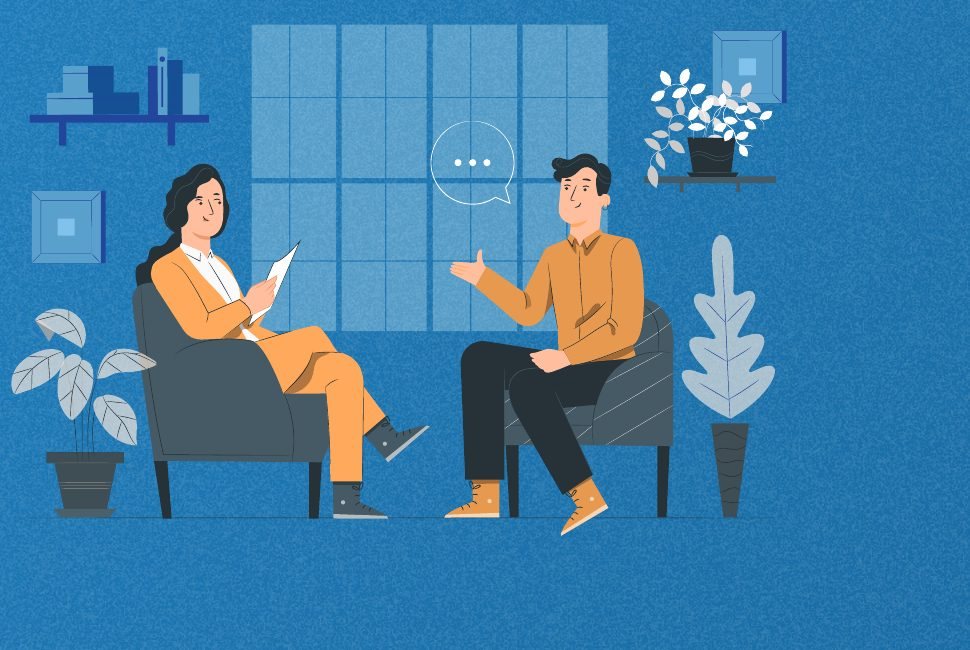
I have conducted user interviews with Brac Bank users to understand the problem deeply — what they are feeling while using the mobile app. These are the questions we asked the users.
- How often do you use the Brac Bank mobile app?
- What are the main tasks or features you use the app for?
- How satisfied are you with the current app design and layout?
- Are there any specific areas of the app that you find difficult to navigate or use?
- Are there any features or functionality that you wish the app had?
- How do you feel about the app's loading speed and overall performance?
- How secure do you feel when using the app to conduct financial transactions?
- Are there any specific changes or improvements you would like to see in the app's redesign?
Problems we find out
Based on the user research data & interviews, several key problems are identified in the current app, these are:
- Navigation and information architecture is confusing and hard to use.
- Poor UI makes it difficult to use and app is slow to load and respond.
- Limited options for account management and transactions.
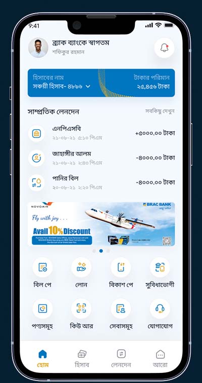
- Only available in English where most of the user's native language is Bangla.
- The app has a limited number of features when compared to other bank's app in the country.
Probable solutions for these
Based on the problems identified, several solutions are proposed for the redesign of the app, including:
- Redesign the navigation and information architecture to make it more intuitive and easy to use.
- Improve user flow and redesign UI to ensure seamless experience, ultimately increasing performance and speed.
- Add more account management and transaction options for its users.
- Create a Bangla version for this app so that the user can easily interact with the app.
- We can add all possible features in the app so that it matches with the other banking apps.
05 — Persona
User Persona
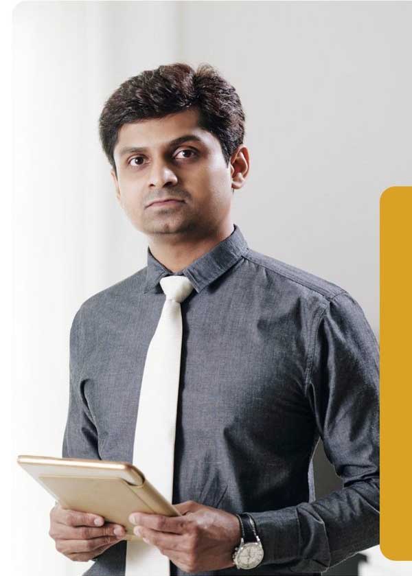
A user persona is a fictional representation of a specific group of users that is created to help design and develop products and services that meet their needs. To better understand the problem we have created a user persona from a group of users we have interviewed.
Sayem Ahmed
"I want the app to have a modern and sleek design, so I can feel confident using it for my financial needs and check my account balance on the go."
Goals
- To easily transfer money
- To check account balance
- To view recent transactions
- To have a user friendly and easy to navigate app
Frustrations
- Slow performance of the app
- Poor design of the app
- Difficulty in accessing information and features
- Difficulty in contacting customer support
Expectations
- App to have a modern and sleek design
- App to make it easy to access information and features
- App to have advanced security features
- App to have features compared to other banks
06 — Empathy
Empathy Map
We created an empathy map to understand users better and prioritize user needs.
- Frustrated with the current app
- Struggles to find the information they need
- Lack of clear navigation
- Leaves the app open and doesn't complete transactions
- Relies on other banking methods
- A user friendly and efficient app
- Advanced security features
- Advanced features to make managing finances easier
- A built in support feature to contact customer support easily
07 — Benchmark
Competitive Analysis
Competitor analysis evaluates other banks' strengths and weaknesses to understand the market and growth potential. The analysis includes studying their products, strategies, customer segments and business models. I have analyzed leading banks as competitors.
Citytouch
- Allows customers to access their bank account and manage their finances from anywhere, and utilizes security features to protect users.
- Enables customers to perform banking tasks such as checking account balances, transferring funds, and paying bills without having to visit a physical branch.
- Provides customers access to a wide range of features such as account management, e-banking, and mobile banking services.
- Some customers may find that the mobile app does not have all the features available through the bank's website or in-person banking.
- Like any other software application, mobile banking apps can sometimes experience technical difficulties or bugs, which can be frustrating for users.
- While mobile banking apps have advanced security features, there is still a risk of hacking or fraud, which can put customer information and funds at risk.

- The Bank Asia mobile application allows customers to access their account and perform banking transactions from anywhere, at any time, using their mobile devices.
- The user interface of the mobile application is intuitive and easy to navigate, making it simple for customers to find what they are looking for.
- The mobile application also includes features such as bill payments, money transfers, and mobile top-up, which allows customers to perform a wide range of banking transactions from their mobile devices.
- Some customers may find that the mobile application does not offer all the same features and functionality as the online banking website.
- The mobile application may experience technical issues, such as slow loading times or unexpected crashes, which can be frustrating for customers.
- Some customers may be concerned about the security of using a mobile application for banking transactions, and may prefer to use the online banking website or visit a branch instead.
Nexus Pay
- The mobile application allows customers to access their banking services from anywhere at any time, making it convenient for users who are always on the go.
- The application has a user friendly interface that makes it easy to navigate and find the desired feature.
- Users can make real time transactions, including fund transfers, bill payments, and account balance inquiries, through the application.
- Some users may find that the application is limited in terms of features compared to other banking apps.
- Users may experience technical issues with the application, such as slow loading times or glitches.
- The application may not be available in all languages, which could make it difficult for users who are not fluent in English to use the app.
08 — Architecture
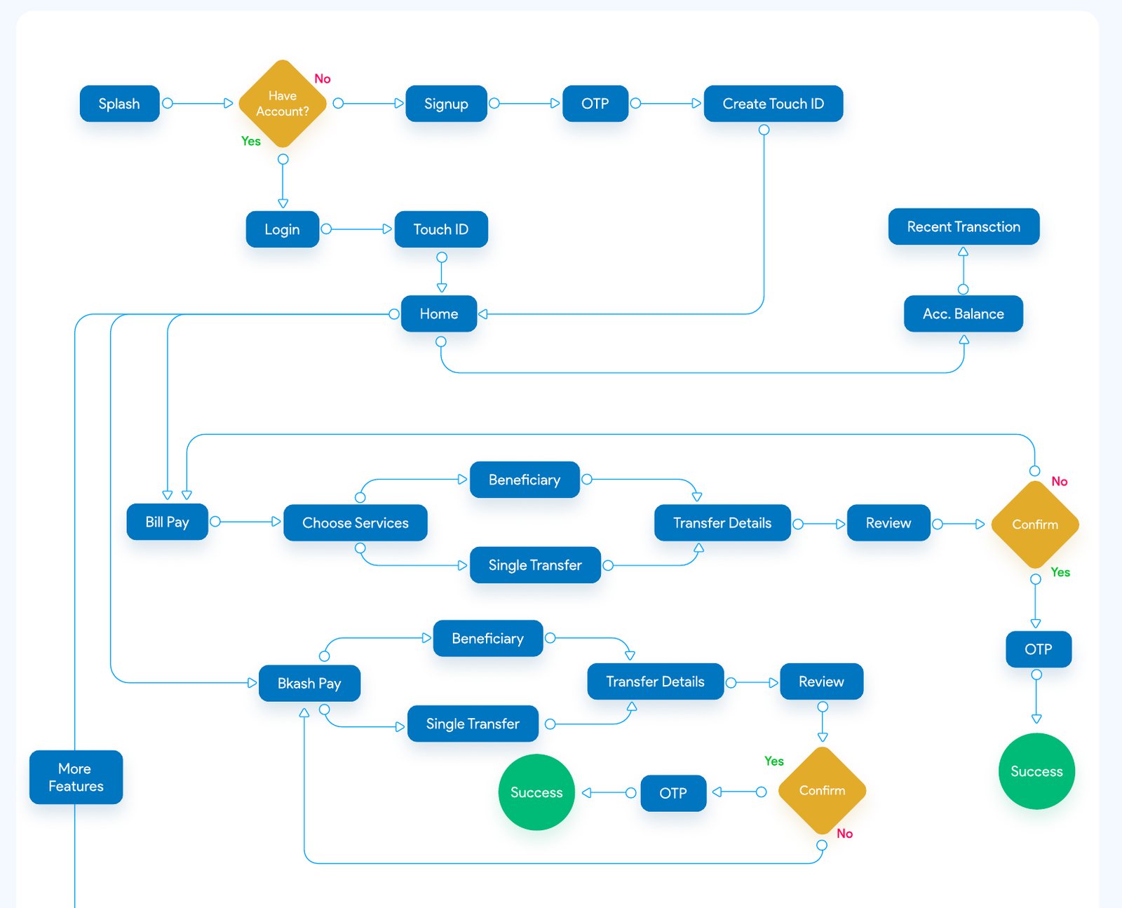
User Flow
A user flow is a chart or diagram showing the path a user will take in an application to complete a task, and allows users to complete desired tasks in as few steps as possible. Although we have created the full user flow of this app, here we have showcased a few features.
09 — Sketching
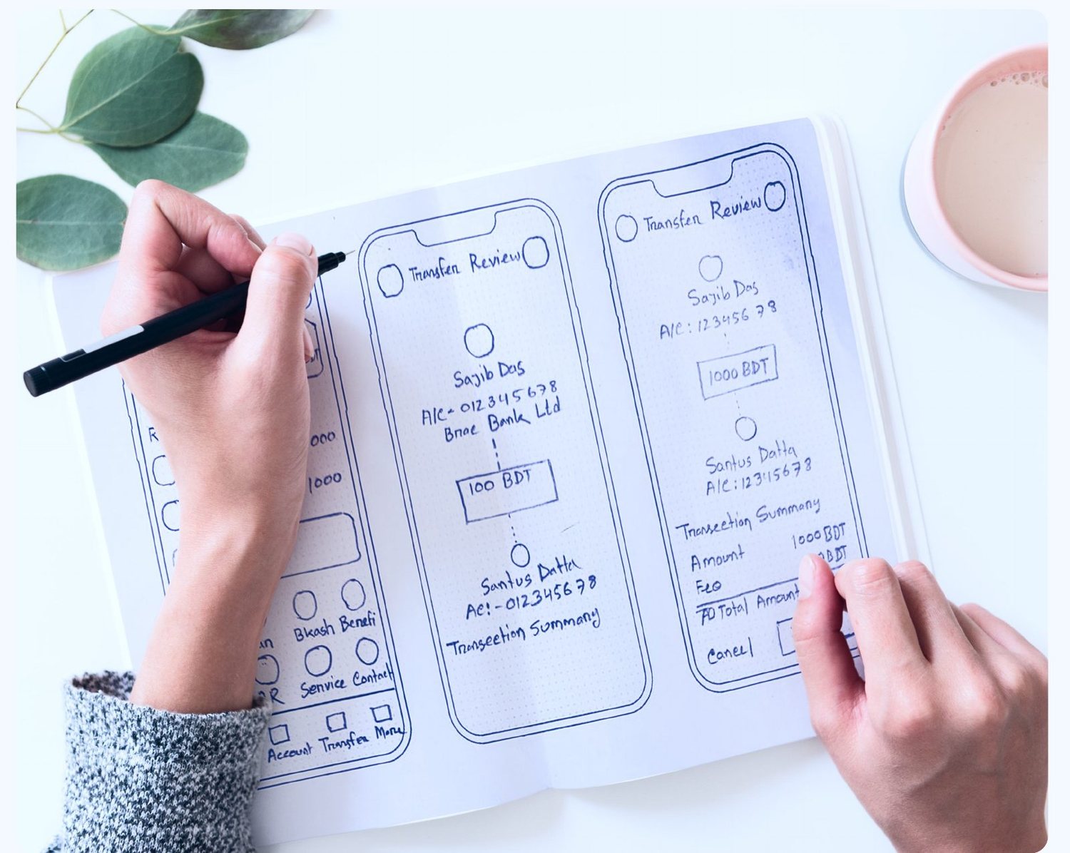
Paper Sketch
A paper sketch is a rough, hand drawn representation of an idea or design, often used as a starting point for more detailed design. It can be used to explore different design options, test out layouts, and make notes and annotations.
10 — Wireframes
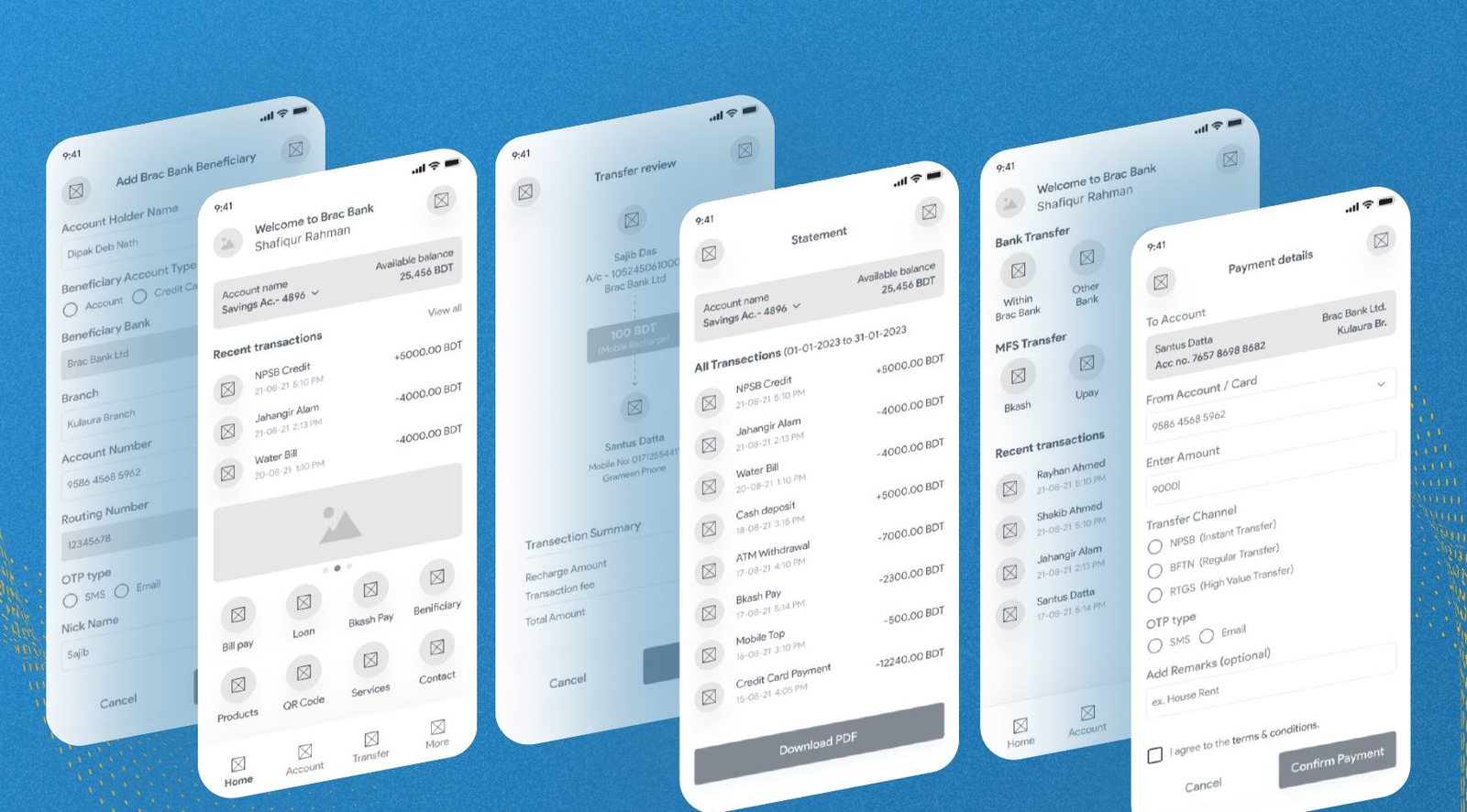
Wireframe
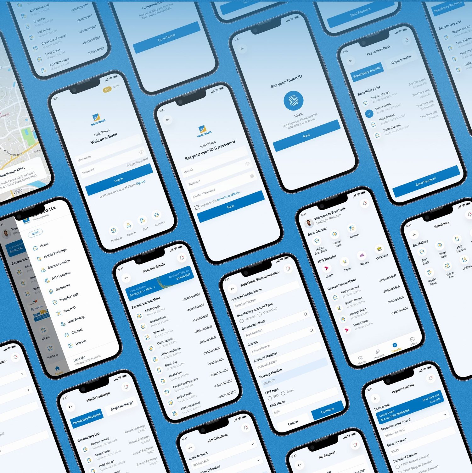
A wireframe is a basic layout of a website or app's UI. It shows the structure and functionality of the design. Wireframes are used early in the design process to gather feedback. We created high fidelity wireframes for the redesign project to make this product better.
11 — Style Guide
Style Guide
A style guide for UI design is a document that outlines the visual and interactive elements of a user interface, including colors, typography, icons, and buttons. Before starting the UI design for this redesign project we determined the style guide to make the UI fresh and clean.
Colours
Typography
Product Sans
AaBbCcDd
01234
Achieve clarity & transparency through modern minimal typeface
12 — Visual Design
Visual Design
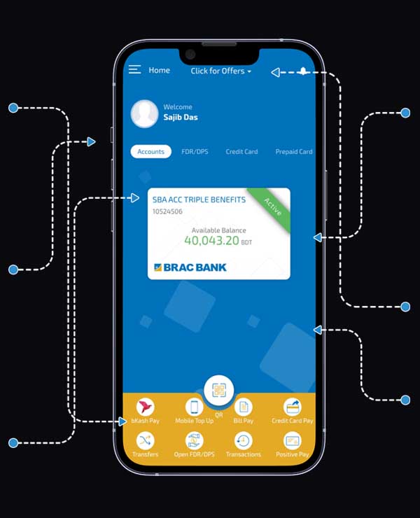
Visual design is the creation of visual elements, such as layout, typography, color and imagery, to enhance the user experience and communicate information. Here we are focusing on being easy to navigate and more user friendly, to provide a seamless experience to our users.
Existing Design
Proposed Design Solution
Solutions I have created
13 — Impact
A product at real scale.
BRAC Bank Astha is one of the most widely used banking apps in Bangladesh — the context every design decision in this project had to hold up against.
Passed one million installs, making it one of the country's most downloaded banking apps.
Used by millions of BRAC Bank customers for everyday banking across Bangladesh.
English and Bangla side by side, opening the app to native Bangla speakers.
Download and user figures describe the scale of the live BRAC Bank Astha product, which this case study explores a redesign of.
- Identifying and addressing user pain points is crucial in improving the overall user experience.
- Testing and feedback from users is important in identifying areas for improvement.
- Consistency in design and language support can help to appeal to a wider user base.
- Understanding the needs of the target audience is crucial in designing an app that meets their needs.
- Iterative design and development process can lead to better results.
- Regular testing and feedback can improve the overall user experience of the app.
Thanks for watching!
Keep exploring
More case studies from my portfolio.