Now rent your dream home more easily! 😍
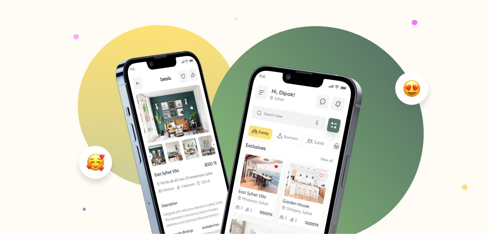
Are you tired of the traditional and tedious process of searching for a home to rent in Bangladesh? RentFinder, the cutting-edge home rental app, is here to revolutionize the way you find your perfect abode.
01 — Overview
Project Overview 🥰
Searching for a new home to rent can be a challenging and time-consuming process, but worry no more! RentFinder, the premium home rent app designed specifically for Bangladesh, is here to revolutionize the way you find your dream rental property. Whether you're a student, a young professional, or a family looking for a cozy abode, RentFinder simplifies the entire rental journey. With an extensive database of properties from all corners of Bangladesh, our app provides you with a wide range of options to suit your preferences, budget, and location requirements.
02 — Principles
Our Rule
Four principles that shaped every decision, from the first interview through to the final prototype.
Research
Comprehensive user research and competitor analysis were conducted from the very beginning.
UX Design
Develop a UX that prioritizes simplicity, ensuring that users can quickly grasp the system.
Visual Design
A captivating UI with interactive colors and captivating icons to attract users.
Prototype Testing
Upon completing the design phase, a prototype was developed to evaluate its performance.
03 — Timeline
Project Timeline
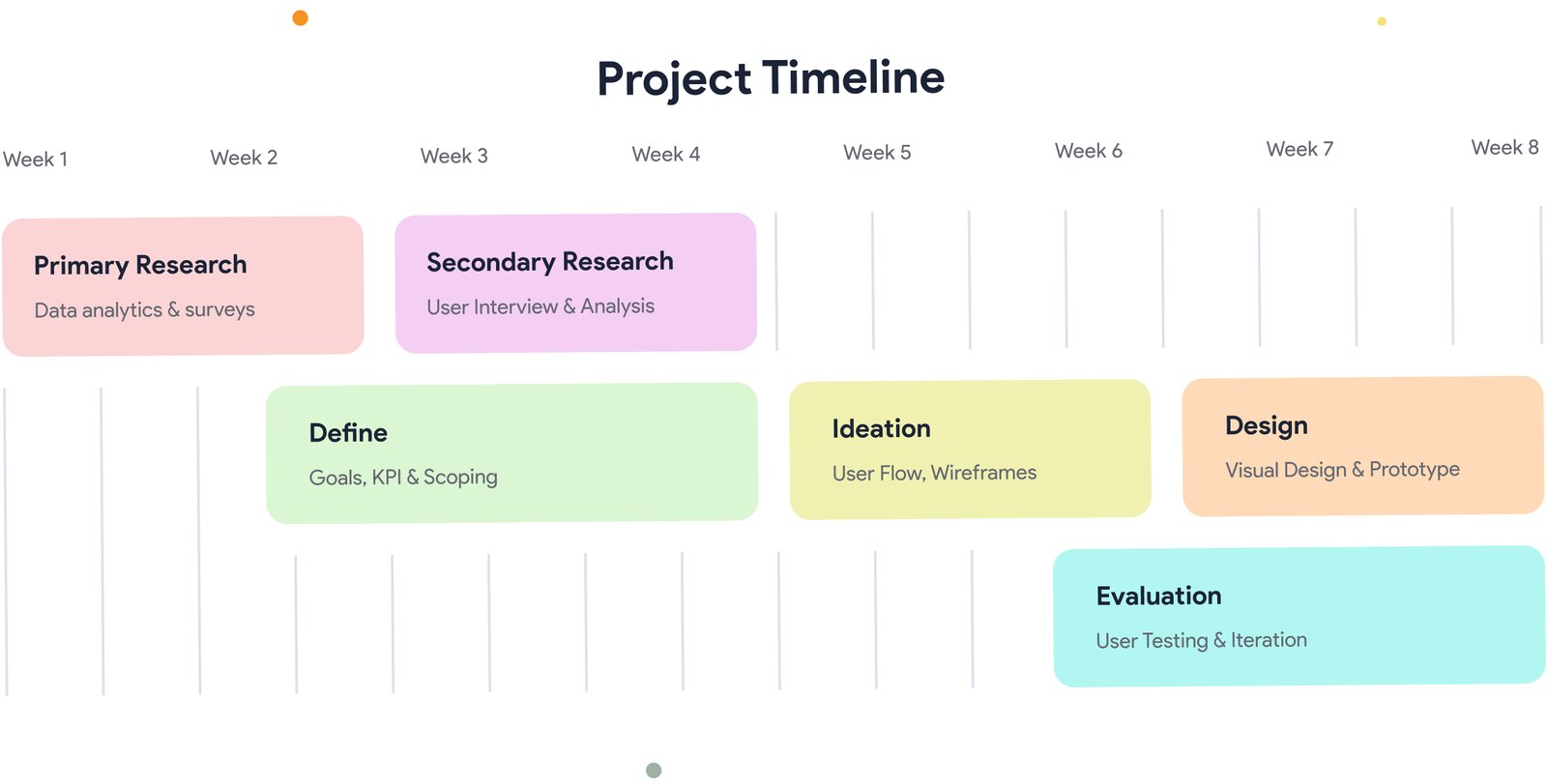
Eight weeks, six phases — from primary research through to user testing and iteration.
04 — Research
User Research
We conducted user surveys and interviews over four weeks, interviewing 15 individuals and recording their responses. This provided valuable insight into their needs, motivations, and frustrations.
Some questions that were asked
How often do you search for rental homes or houses?
What are the main factors you consider when searching for a rental property?
How do you typically begin your search for a rental home or house?
What features or functionality do you find most important in a house rental app?
Have you used any house rental apps before? If so, what did you like or dislike about them?
Can you describe a recent experience you had while searching for a rental property?
What information do you find essential to have in a rental listing?
05 — Insights
Research Insights
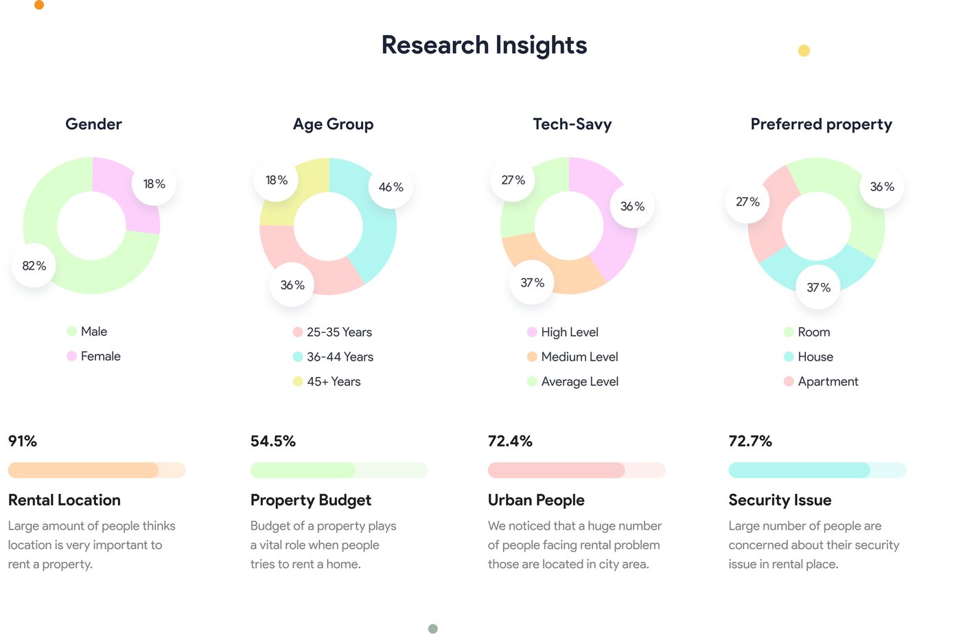
Demographics, tech comfort, and property preference across the interview group — and the four themes that came up most.
Rental Location
A large number of people think location is very important when renting a property.
Property Budget
Budget of a property plays a vital role when people try to rent a home.
Urban People
We noticed that a huge number of people facing rental problems are located in city areas.
Security Issue
A large number of people are concerned about their security issue in a rental place.
06 — Define
Problems & Solutions
Our task is to make a simple & convenient solution for everyone, where there will only be in-demand functions for our users so that they use it easily.
07 — Benchmark
Competitive Analysis
Where the existing players are strong, where they fall short, and the gap Rent Finder can move into.
(The Tolet)
- Extensive nationwide property listings.
- Advanced search filters for precise property searches.
- User interface is a bit clumsy.
- Limited features compared to other competitors.
- Improve user interface to ensure a smooth experience.
- Introduce unique features or services that differentiate Rent Finder from The Tolet.
(Bproperty)
- Established brand recognition and market presence in Bangladesh.
- Diverse property options (apartments, houses, commercial spaces).
- Limited coverage in specific regions or cities.
- User interface and app navigation may need improvement.
- Expand coverage to more regions and cities in Bangladesh.
- Improve the user interface and overall app experience.
(Basa Bhara)
- Focus on rental properties for students and young professionals.
- In-app purchase options for house decoration items.
- Confusing user interface.
- Potential need for diversifying property options.
- Focus on creating easy navigation and experience.
- Expand property listings to cater to a wider audience.
08 — Personas
User Persona
Based on the analysis, we developed two user personas. These serve as a direct reflection of the collected data, showcasing a diverse range of user types, their goals, frustrations, and other relevant factors.

Pranto Dey
University Lecturer"Finding my perfect rental home should be effortless with a user-friendly app and accurate search filters."
Goals 🎯
- Conveniently located rental near workplace
- Budget-friendly with amenities (secure parking, lift)
- User-friendly app for easy browsing
- Precise search filters (bedrooms, rental price)
Pain Points 😩
- App interface challenges slow property search
- Limited search filters hinder finding suitable properties
- Frustration with time-consuming communication for availability
Expectations 😎
- User-friendly app with easy navigation
- Robust search filters for precise property searches
- Accurate property information and availability
- Efficient communication with property owners

Ali Rahman
Businessman"I expect an app that offers convenience, accurate property details, and seamless communication."
Goals 🎯
- Rental property in Dhaka for convenience
- Well-maintained and secure space for relaxation and work
- Rental app with comprehensive property information
- Efficient property search for work-life balance
Pain Points 😩
- Limited rental options for business professionals
- Lack of business-oriented amenities in commercial areas
- Difficulty finding reliable property information
Expectations 😎
- Wide range of rental properties available in Dhaka
- Accurate property information and amenities
- Secure and well-maintained rentals
- Efficient and time-saving rental process
09 — Architecture
User Flow
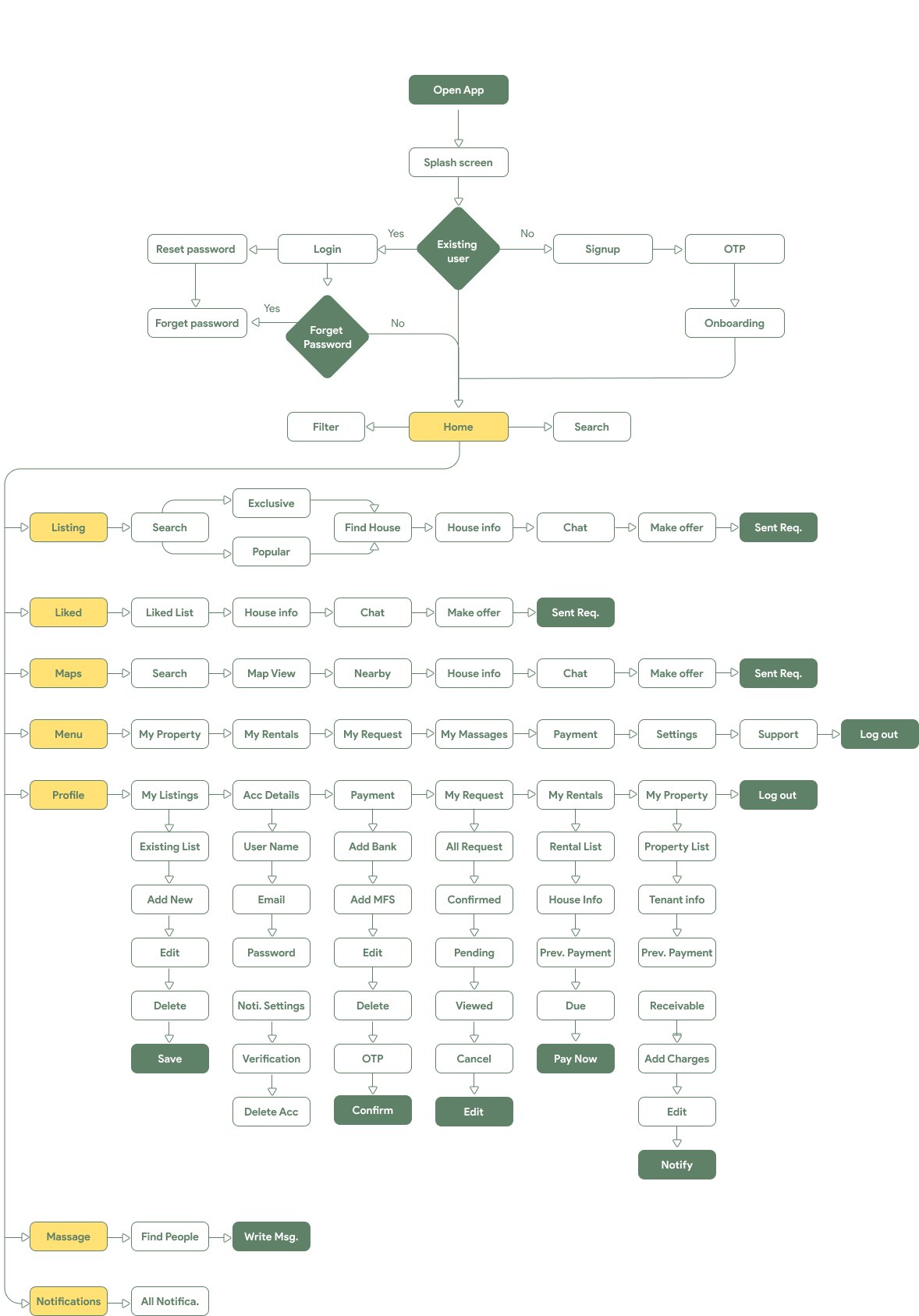
The complete path a user takes through the app — from splash and onboarding through listings, liked properties, maps, menu, profile, messaging, and notifications.
10 — Journey
User Journey Map
We created a user journey map of Pranto's experience. It helps to identify pain points, opportunities, and moments of delight to improve the user experience.
Pranto, a young professional, discovers Rent Finder through recommendations or online searches.
He downloads the Rent Finder app from the app store onto his smartphone.
Pranto launches the app and sets his location, budget, and desired amenities.
He uses the search feature to browse through available rental listings in his preferred area.
Pranto selects a listing to view more details, including description, photos, amenities, and rental terms.
He compares multiple listings, favoriting the ones that align with his preferences.
Pranto contacts the landlords or property managers directly through the app to inquire about availability and schedule viewings.
He communicates and arranges appointments conveniently within the app.
Pranto visits the selected properties at the scheduled times.
He assesses each property based on location, condition, amenities, and suitability for his needs.
Pranto chooses the rental property that best fits his requirements and completes the agreement.
After completing all the necessary procedures, he joyfully transitions into his new home, filling his heart with happiness.
11 — Wireframes
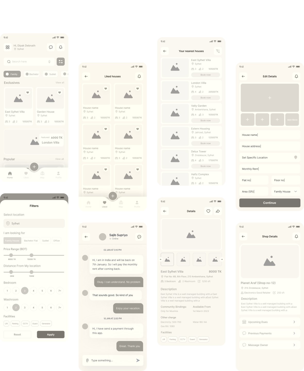
High Fidelity Wireframes
Structure and functionality mapped out before any colour went down — home, filters, liked houses, chat, listing details, and property management.
12 — Style Guide
Style Guide
A well-designed style guide ensures that the product is visually appealing and easy to use, which ultimately enhances user satisfaction and minimizes confusion.
Gilroy is a modern and versatile sans-serif font with clean lines and balanced proportions. Its simplicity and legibility make it perfect for various design applications.
Colors
Carefully curated colors for the Rent Finder app create an appealing design. A harmonious palette enhances the user experience with trust, sophistication, and tranquility.
Iconography
We incorporated icons that greatly enhance usability and engagement with their intuitive and easily recognizable designs.
13 — Visual Design
Visual Designs
The home screen in both English and Bangla, built so the whole experience is accessible to a wider audience.
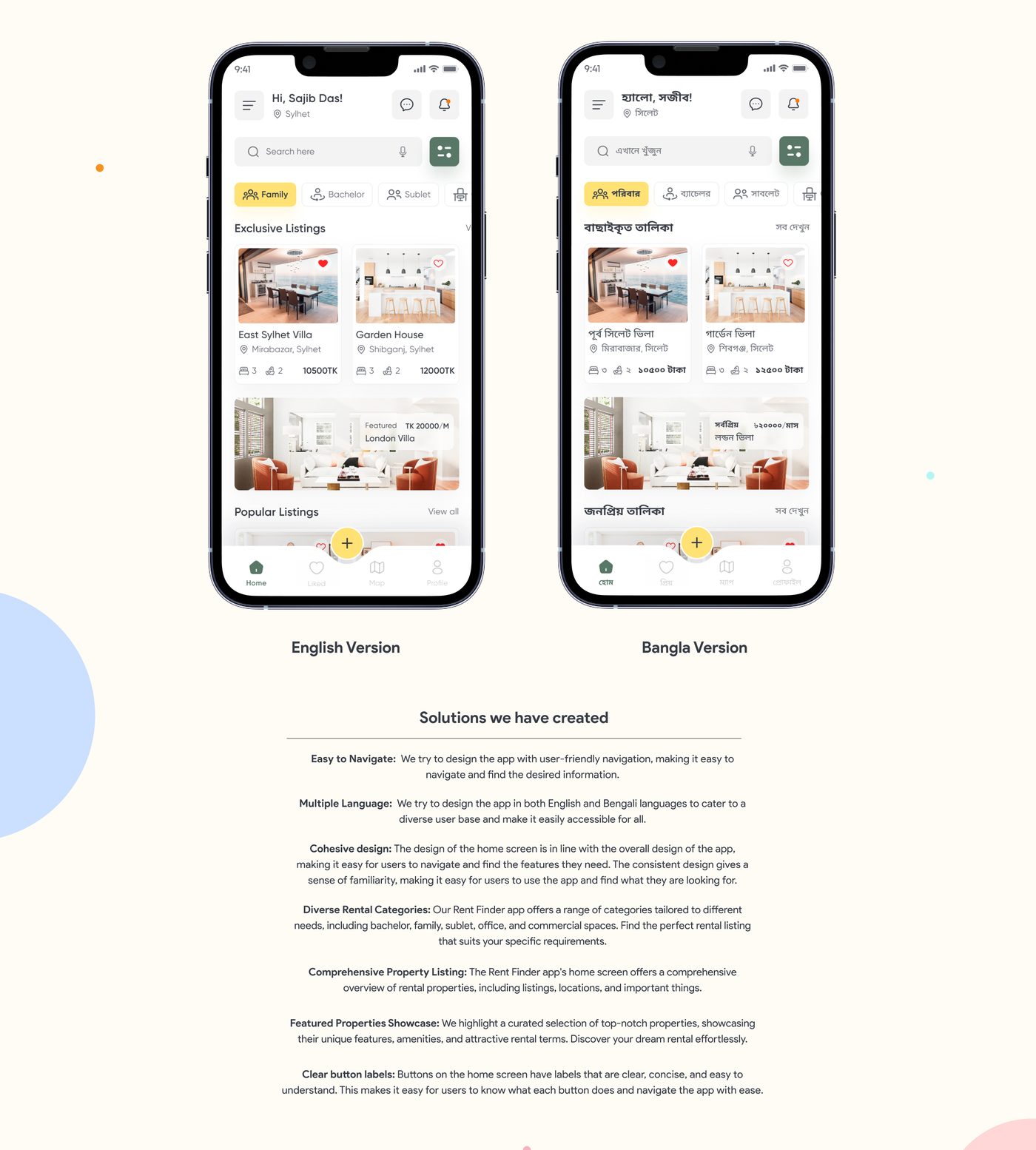
Solutions we have created
14 — Search
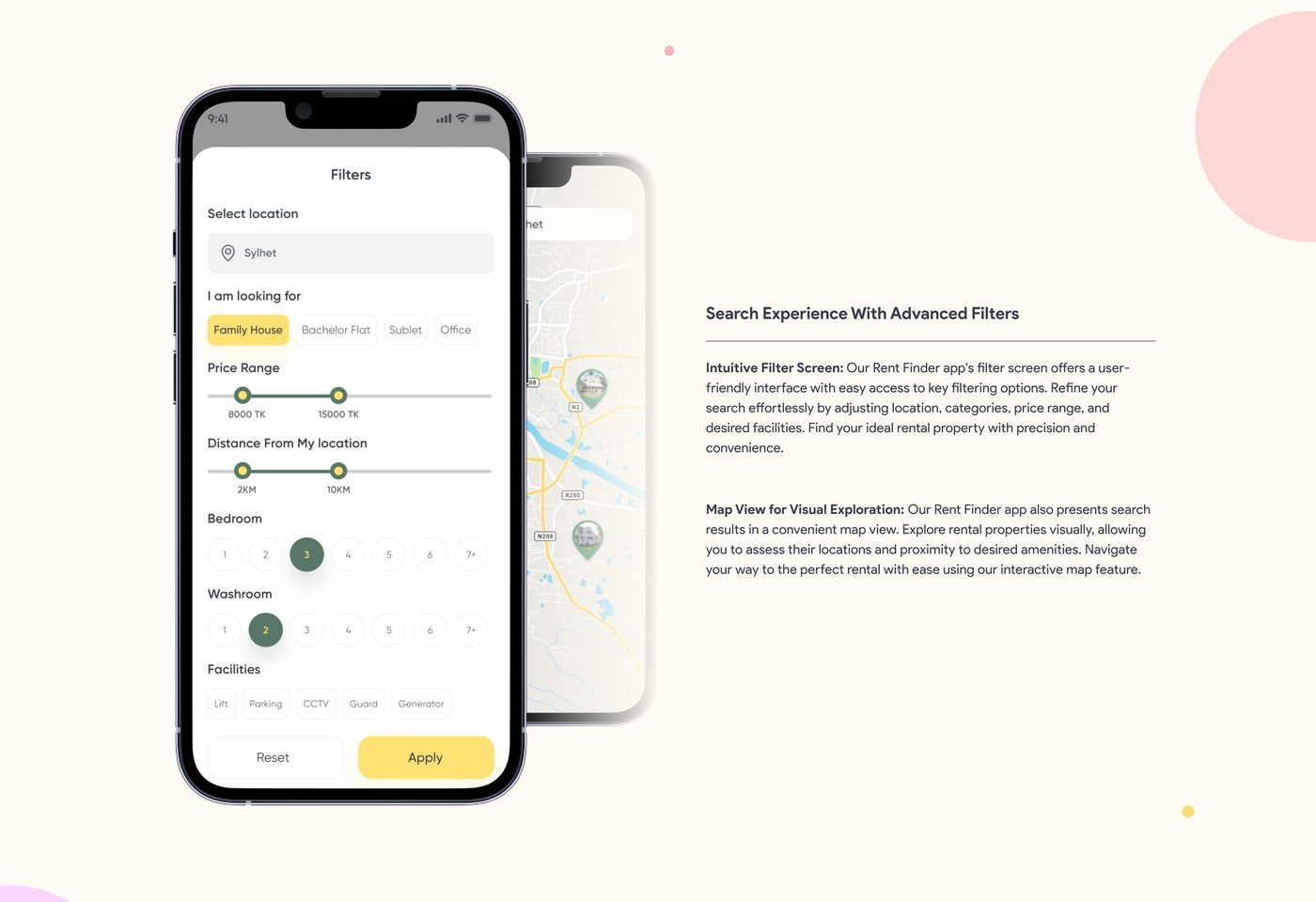
Search Experience With Advanced Filters
Intuitive Filter Screen
Our Rent Finder app's filter screen offers a user-friendly interface with easy access to key filtering options. Refine your search effortlessly by adjusting location, categories, price range, and desired facilities. Find your ideal rental property with precision and convenience.
Map View for Visual Exploration
Our Rent Finder app also presents search results in a convenient map view. Explore rental properties visually, allowing you to assess their locations and proximity to desired amenities. Navigate your way to the perfect rental with ease using our interactive map feature.
15 — Details
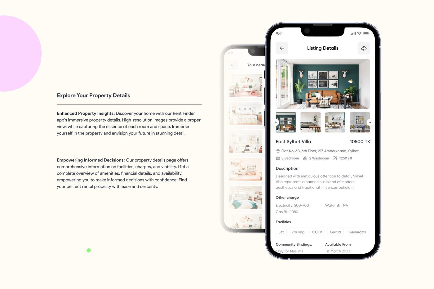
Explore Your Property Details
Enhanced Property Insights
Discover your home with our Rent Finder app's immersive property details. High-resolution images provide a proper view while capturing the essence of each room and space. Immerse yourself in the property and envision your future in stunning detail.
Empowering Informed Decisions
Our property details page offers comprehensive information on facilities, charges, and viability. Get a complete overview of amenities, financial details, and availability, empowering you to make informed decisions with confidence.
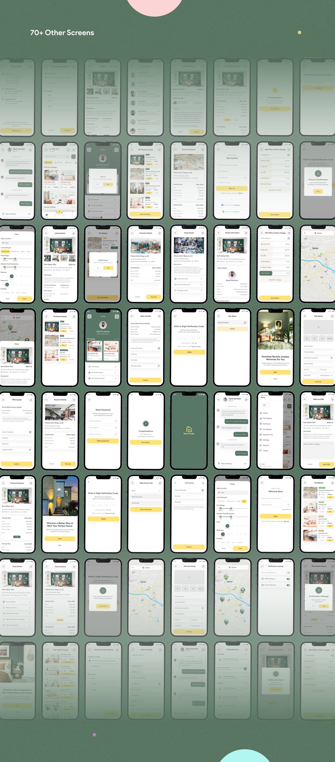
16 — Reflection
Our Take-Aways
What was hard, what we learned, and where this goes next.
Challenges
Developing a project focused on house rentals posed several challenges for our team. As we delved into the research phase, we quickly realized that selecting suitable interview candidates was a daunting task. However, we persevered by conducting thorough investigations to create an application that would significantly improve the daily lives of its users.
Learnings
Engaging in a multifaceted endeavor imparted the valuable lesson of adhering to self-imposed timelines, fostering a disciplined approach to our work. The inclusion of user feedback and iterative processes undeniably enhanced the conceptualization of our application, yielding a truly influential outcome.
Next Steps
Collecting more and more feedback, exploring use cases, and brainstorming ideas for any other features that get highlighted from the feedback.
Thanks for watching! 🥳
For work inquiry
dipak.cse.mu@gmail.comKeep exploring
More case studies from my portfolio.