Walmart
Mastercard App
A seamless mobile experience that brings your Walmart Mastercard to life — manage your balance, make payments, track installments, and earn rewards all in one place.
Project
Overview
The Walmart Rewards Mastercard has no dedicated app, leaving cardholders without key features like push notifications, biometric login, installment tracking, and online disputes. This project designs a native app to address these gaps with a smarter home screen and streamlined flows.
Responsibilities
- Research: Collected complaints from online forums, and ran interviews and surveys with Walmart Rewards Mastercard users.
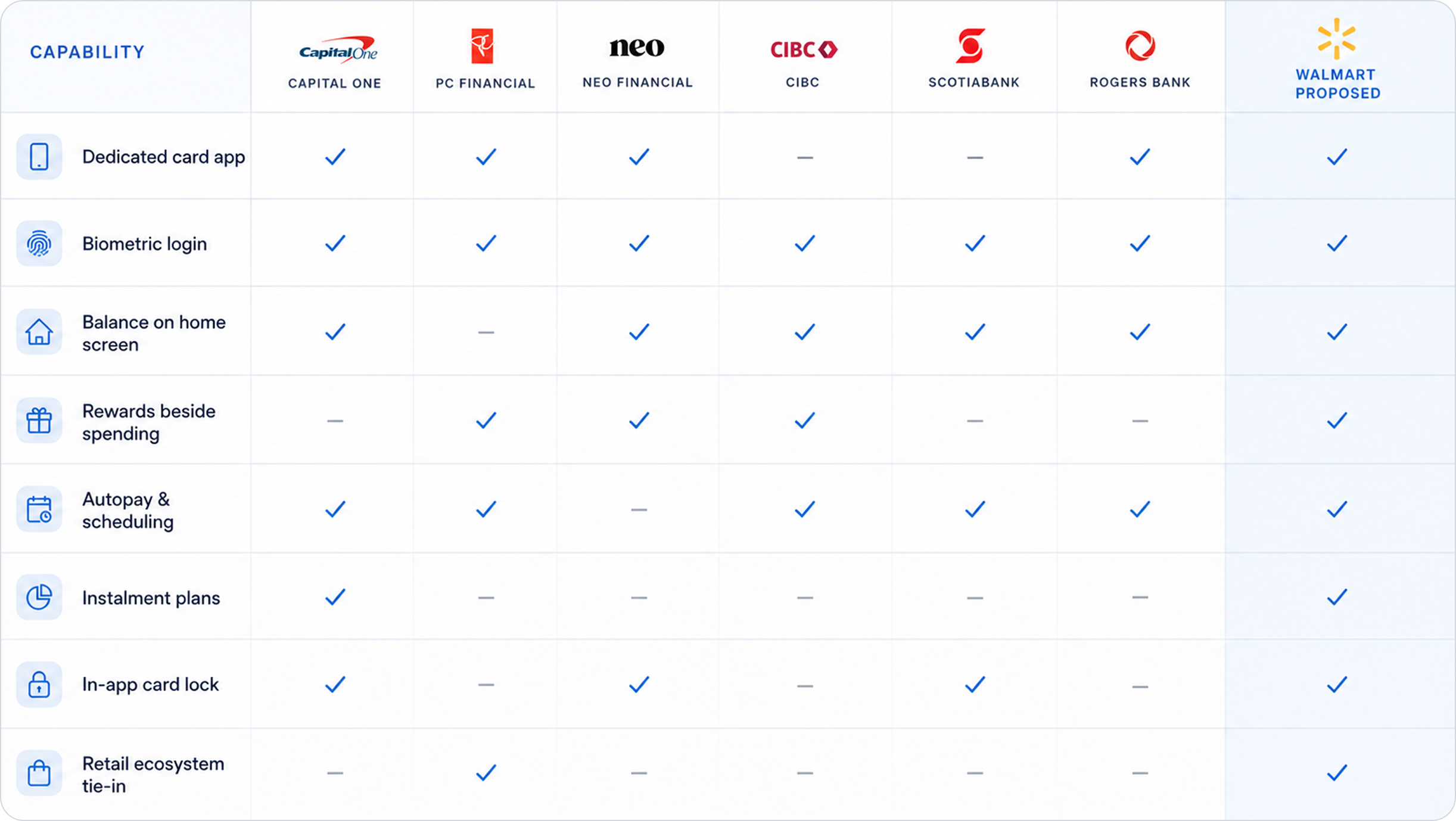
- Benchmarking: Analyzed 5–6 Canadian banking apps to decide what to borrow and what to leave out.
- UX: Used the MoSCoW method to prioritize scope and structure the project.
- UI: Built the visual system following Walmart's own brand guidelines, and designed a dedicated component design system.
- Prototype: Built a clickable prototype of 100+ screens with micro-interactions.
Target user
- Walmart Credit Card and Mastercard holders
- Weekly in store and Walmart.com shoppers
- People who carry a balance and watch due dates
- Rewards earners who never redeem what they have
The Problem
There was no app to review, so research started with what people already say in public: credit card forums, review sites and complaint boards. Six themes kept repeating. Two stood out above the rest — the total absence of a native app, and how little of the account is visible once a user does log in.
What people run into
- Every check in starts with a browser login, on a phone
- No information or tracking for instalment plans
- The web preview shows a balance and little else
- Payments run through a bare, outdated web form
- Rewards are tracked separately from balance and spend
- Declines and disputes are explained with almost no clarity
What the app answers with
- A native app with Face ID and push, scoped to this card only
- Balance, due date and credit used on the home screen
- Dedicated instalment tracking and management
- A real payments interface with scheduling and autopay
- Rewards merged into the same view as spending
- Plain language status on every dispute and decline
Design
Process
With a long list of possible features, we used the MoSCoW method to separate what the app must have from what it could wait for. Everything in Must Have blocks a first release; everything in Won't Have is a deliberate no for this phase, not an oversight.
Non negotiable
Launch blockers- Dedicated mobile app replacing browser only account access
- Balance and due date on the home screen
- Full, searchable transaction history
- In app transaction disputes
- Biometric login for quick access
High value
Not launch blocking- Flexible instalment terms
- Notification centre
- Real time rewards tracking
- Push alerts for due dates and declines
- Autopay and payment scheduling
- Live agent chat inside the app
Nice additions
Later phases- Digital receipt section inside transaction details
- Spending insights by category
- Personalised Walmart offers and rewards
- Paperless statement preferences
- In app card lock and unlock
This phase
Out of scope for now- Credit score monitoring and credit building tools
- Full Walmart shopping / grocery ordering functionality
- Broader budgeting and personal finance management
Research
With no product to audit, desk research came first. What mattered was not that people complained, but what each complaint actually costs them day to day — which is what set the severity, and the order of everything that followed.
These are not quotes from any single named reviewer. They are recurring themes distilled from public discussion of the existing Walmart Credit Card experience, used here to ground the problem in something real rather than assumed. Severity reflects how often a theme appeared and how directly it blocks a core task.
User
Interview
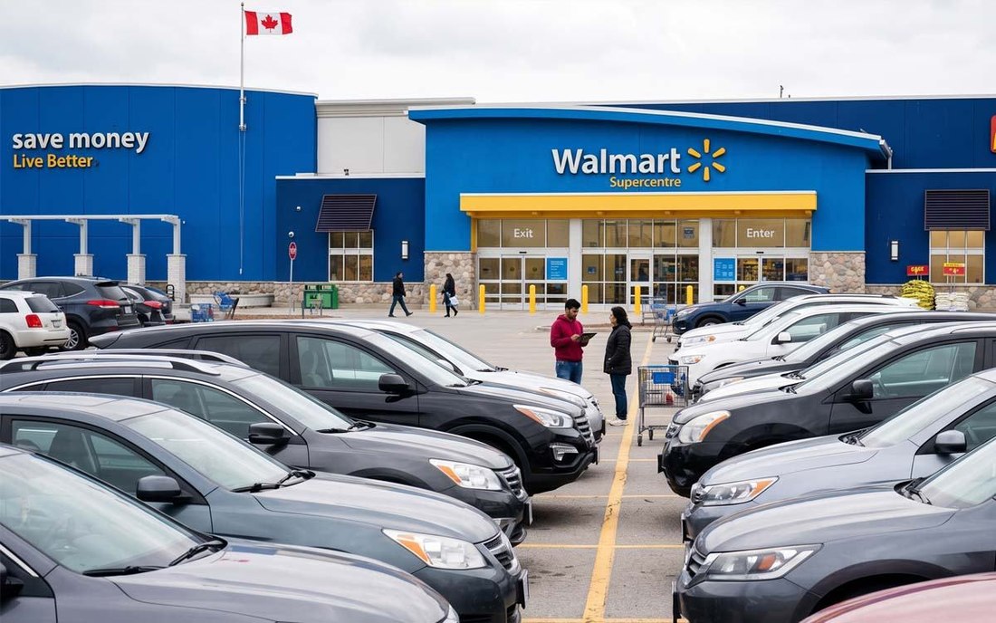
Desk research told us what people complain about in public. Interviews told us what they actually do. We spoke to Walmart Credit Card holders in two settings: remote sessions with people who use the card weekly, and short intercepts outside a Walmart store, catching shoppers right after they had paid.
How do you check your balance?
How do you pay each month?
Can you find rewards balance?
How do you review older transactions?
Have you seen unrecognized charges?
What do you want on the home screen?
What we heard
- Most people could not recall their rewards balance.
- Everyone started at a browser, and most had the login saved in their password manager.
- Due dates were tracked outside the product, in calendar reminders or from the paper statement.
- Older transactions felt unavailable, not discoverable.
What it changed in the design
- Rewards moved onto the home screen beside the balance instead of into a separate tab.
- Balance and due date became the first thing after biometric login, with no navigation.
- Push alerts before the due date replaced the calendar reminders people had built themselves.
- Transaction history was made searchable, with filters by date and merchant.
Sessions were run with 10 cardholders across remote and in-store settings. Quotes and themes are paraphrased, and no participant is identified.
User
Persona
One user carried the project. Maliyat shops at Walmart most weeks, pays her card from her phone, and earns rewards she rarely gets around to spending. Every design decision was checked against whether it made her weekly check in faster.

"I just want to check my balance, pay, and move on"
Goals
- Check balance and due date at a glance
- Track and redeem rewards easily
- Get alerts before payments are due
- Understand exactly what she is charged
Motivation
- Convenient usage
- Modern visual design
- System integration
- Professional growth
Frustrations
- Browser login every time, just to check a balance
- Cannot find real transaction history
- Does not know her reward balance
- Every other card has an app, this one does not
"Why do I have to log into a website every single time?"
"I can't even see my past transactions properly."
A native app would save her time every week.
A connected experience would feel modern and trustworthy.
Opens a browser and logs in to check balance and pay.
Gives up trying to find older transactions.
Annoyed at the login. Confused by the limited preview.
Anxious as the due date gets close.
Pain
- No app at all, browser only account access.
- No real transaction history, no proper payments interface.
Gain
- A native, focused app just for this card.
- Full transaction history and real payment tools.
Competitive
Analysis
Six apps benchmarked across retail cards and full banking suites, each reviewed for what works, what does not, and what it means for a Walmart specific card experience. Benchmarking against the less obvious ones set a much clearer standard for what modern actually means in this category.
Style
Guide
Walmart's brand palette uses True Blue for structure and primary actions, Spark Yellow for rewards and highlights, and Bentonville Blue for depth and typography, with semantic colours for key states.
Primary
Brand coreSecondary
SupportNeutrals
StructureSemantic
Feedback statesTypography
Everyday Sans keeps the experience clear and consistent, with hierarchy defined through size and weight from 32px to 12px.
Everyday Sans
Walmart's typeface of choice for a clear, friendly and modern experience. Light through Medium covers every style in the product; nothing heavier is needed.
User
Flow
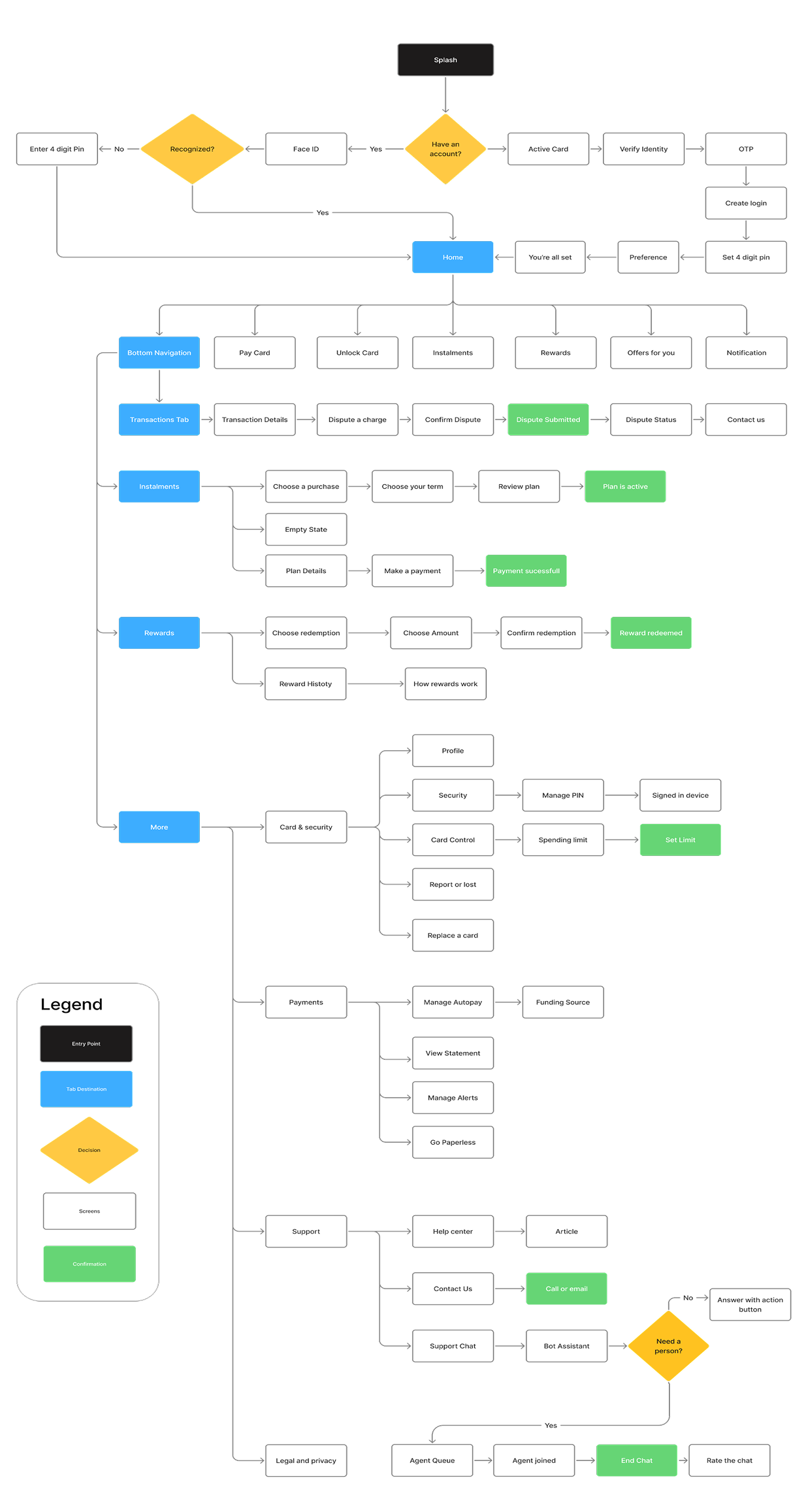
Six journeys mapped end to end. Onboarding runs once and branches on a single question; everything after it is built for a returning user who wants the balance and nothing else. Each of the four core tasks lands on an explicit confirmation, because the moment a payment or a dispute leaves your hands is the moment people most want to be told what happened.
Wireframe
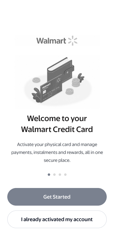
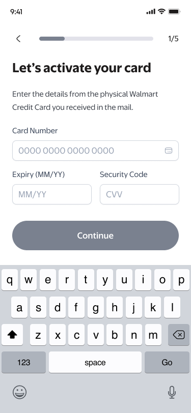
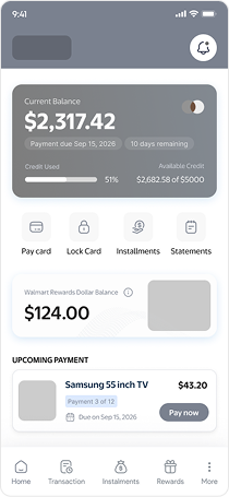
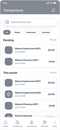
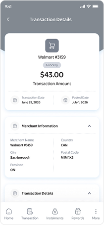
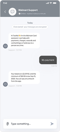
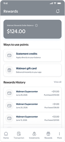
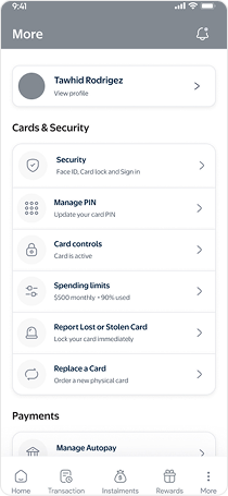
Structure was settled in greyscale before a single brand colour went down. The question at this stage was only hierarchy: what sits above the fold, how far the balance is from the pay button, and how many taps stand between a transaction and a dispute.
UI
Components
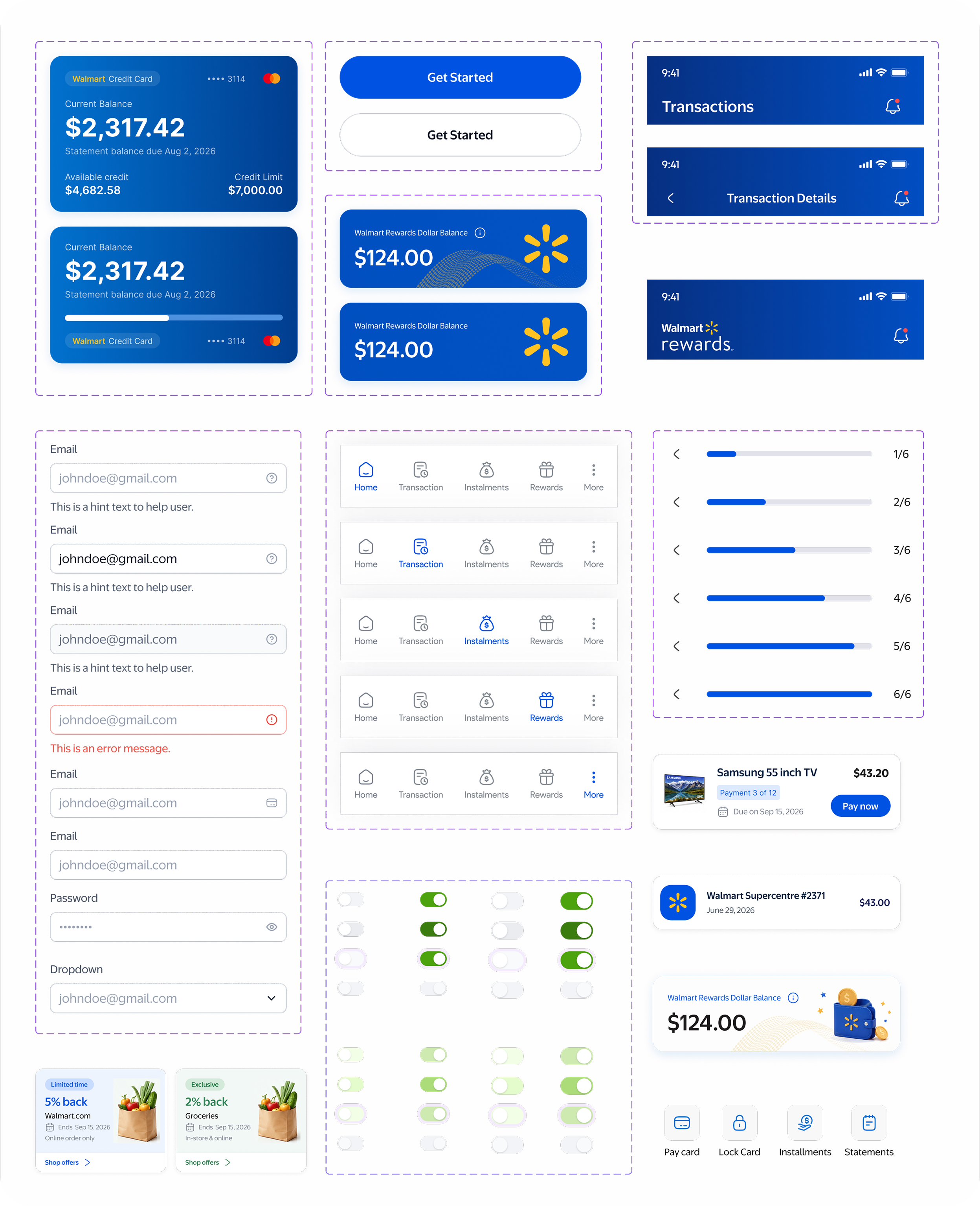
A small component set, sized for thumbs and built to repeat. Inputs carry their state in the border rather than in a paragraph of red text. Buttons keep one primary action per screen. The tab bar holds five destinations and never moves, so the way back is always in the same place.
Visual
Design
Screens are built as a working prototype rather than a flat set of frames. The visual language stays close to Walmart's own: blue for structure and action, yellow reserved for rewards and moments of attention, and a lot of white space so the balance is never competing with anything.
Home, in one glance
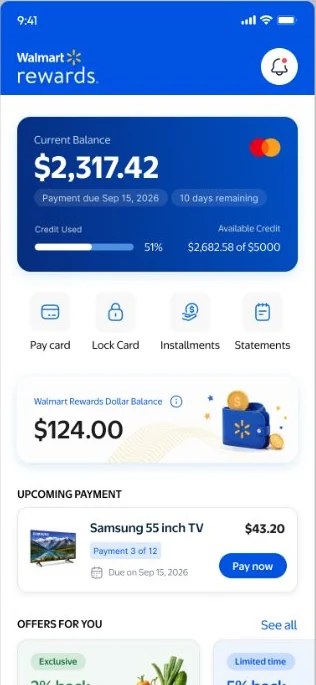
Balance, due date and credit used sit above the fold, followed by four quick actions and the reward balance. A notification bell sits top right on every screen, so a payment reminder or a security alert is never more than one tap away.
Activation that ends in a working card
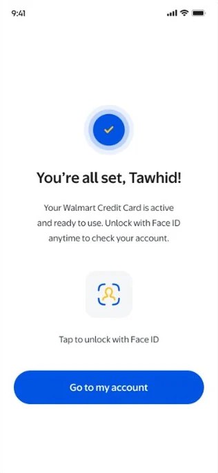
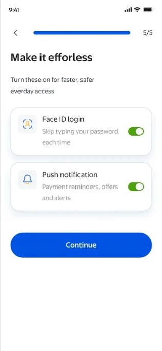
Six steps, one per screen, with a progress bar that never hides how much is left. It closes on Face ID and a PIN, so the next visit takes a fraction of a second.
Instalments, from purchase to plan
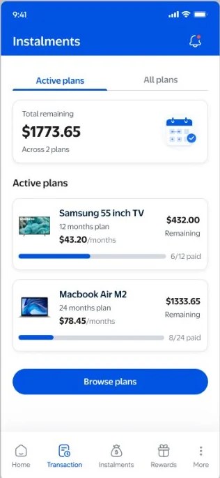
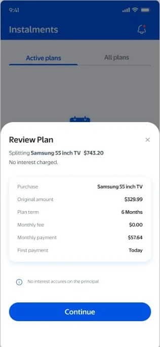
Eligible purchases can be split into fixed monthly payments in four taps. Every active plan shows what is left, how many payments remain, and the full schedule underneath.
Every charge, explained
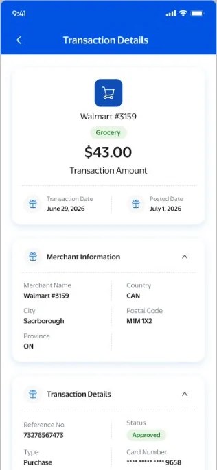
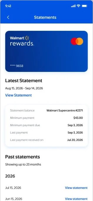
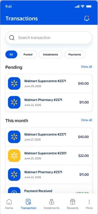
Transaction history is searchable and filterable, and each charge opens into merchant details, dates and a reference number. Disputing takes one tap from the detail screen and never leaves the user guessing what happens next.
Controls where people expect them
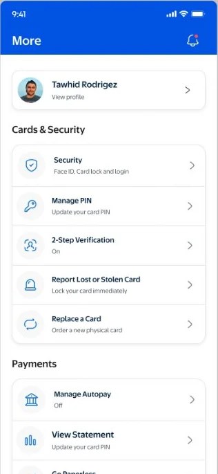
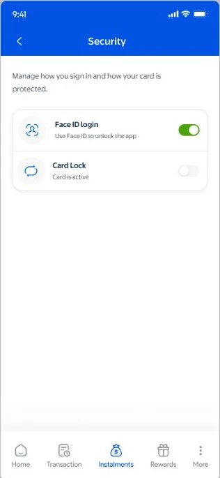
Card lock, PIN management, Spending limits, two step verification and alert preferences live one tap from the More tab, in plain language. Security settings that are easy to find are security settings people actually use.
Live
Prototype
The full build runs in the browser, not as a flat set of frames. Onboarding, payments, instalments, rewards and disputes are all clickable, with real state carried between screens. Open it below and use it the way a cardholder would.
Try it yourself
Best experienced at phone size, which is how the frame beside this is set. If the embed is blocked by your browser, the button below opens the same build in a new tab.
- Activate a card and set a PIN
- Make a payment and watch the balance change
- Split a purchase into an instalment plan
- Redeem rewards, then dispute a charge
Four lessons that shaped how we approached this project and will inform how we build what's next.
Designing for an existing, well known brand raises the bar for on brand clarity. Walmart's identity had to feel present without overwhelming financial UI conventions.
Benchmarking against six real apps, not just the obvious ones, set a much clearer standard for what modern actually means in this category.
Grounding a speculative concept in real research made the problem framing far more credible than starting from assumptions.
MoSCoW prioritisation made scope conversations concrete, turning a long feature wish list into a clear first release.
Keep exploring
More case studies from my portfolio.