Fillies and Boots
A made-in-Italy bespoke footwear brand with beautiful products and a shopping journey that got in their way. Rebuilt around easier navigation, sharper search, and made-to-order customization.
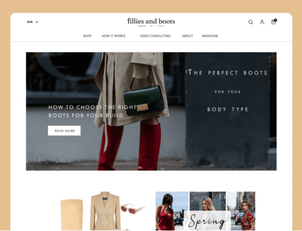
01 — Overview
Great products, buried behind a difficult journey.
Fillies and Boots is a bespoke footwear label producing made-in-Italy boots, sold direct to customers across Europe. The catalogue was strong and the craft was real, but the site around it was doing the brand no favours.
The redesign focused on the parts of the experience that stood between a visitor and a purchase: how products are found, how they are compared, and how a made-to-order pair actually gets configured and bought. Improved navigation and a new customization feature let customers find and personalise products far more easily, lifting both engagement and conversion.
02 — The Problem
High-quality products were not enough on their own.
The previous version of the Fillies and Boots website failed to attract customers despite offering high-quality products. The cumbersome user journey made it difficult for customers to find the perfect products, leading to a frustrating user experience.
Hard to find the right pair
Browsing depended on scrolling through the catalogue. With no meaningful way to narrow by size, style, or material, finding one specific pair meant working through everything.
A journey with too many steps
The route from landing on the site to reaching a product page was longer than it needed to be, and it was easy to lose your place partway through.
Bespoke, but not configurable
The brand's core promise is made-to-order footwear, yet the site offered no way to actually personalise a pair before buying.
03 — Target Audience
Fashion-forward buyers who expect both style and function.
Our target audience consists of fashion-forward individuals who value both style and functionality in their footwear. They seek a seamless shopping experience that allows them to quickly find products that match their needs and preferences.
04 — Research
Grounding the redesign in evidence.
Add the research that informed this project here — analytics from the previous site, competitor teardowns, or customer feedback.
05 — Solutions
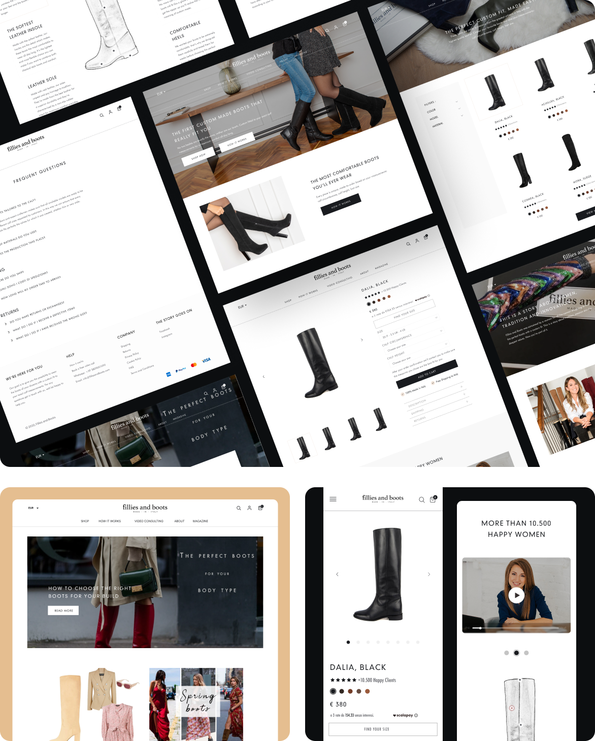
A comprehensive redesign of the shopping journey.
To address these issues, we implemented a comprehensive redesign of the website. The new design focuses on enhancing the user journey, making it intuitive and straightforward to navigate.
Intuitive navigation
The structure was rebuilt so the path from landing page to product is short and obvious, and you always know where you are.
Advanced search & filtering
Filtering options let customers narrow the catalogue to what they actually want, instead of scrolling until they find it.
Product customization
A customization feature lets customers personalise their purchase, meeting the growing demand for unique and tailored products.
A seamless journey
Every step from browsing to checkout was tightened so the experience feels considered end to end, matching the quality of the product.
06 — Visual Design
An editorial feel that lets the product lead.
Generous whitespace, large photography, and quiet typography — so the boots carry the page rather than competing with the interface around them.
Palette
Sampled from the redesign — warm neutrals that sit behind the photography instead of in front of it.
Customization flow
07 — Outcome
What the redesign changed.
Easier navigation
Customers now find it easier to navigate the site and locate the products they want.
Wider audience reach
The new customization feature has attracted a wider audience, increasing personalized product purchases.
Higher conversion rates
Fillies and Boots has seen higher conversion rates and established itself as a go-to destination for bespoke footwear.
08 — Reflection
What this project reinforced.
Product quality does not carry a store on its own. If the journey to the product is hard, the craft behind it never gets seen.
Filtering is not a secondary feature on a catalogue site. For shoppers who know roughly what they want, it is the primary way they navigate.
If a brand's promise is made-to-order, the interface has to let people actually make an order to order. Customization moved the site closer to what the business already stood for.
For a fashion brand, restraint in the UI is the point. The interface should get out of the way of the photography.
Thanks for reading.
Keep exploring
More case studies from my portfolio.